Thursday, 22 June 2017

Week 12 - Independent Study

2 marking schedules for attendence


Final real time images  -  how they relate to "theory"

The overall form of the building is curvy and rarely have straight lines, which essentially make the form of the building much more comfortable and relative to nature.

The building uses timber and concrete as the main material, where the concrete will provide a clean, purify look and the wood will compromise the lifelessness of concrete, and adds a bit of warmth to the building.

There is a spiral staircase that goes up to level 1 from the ground floor. Similar to the bridge (ramp) connecting from UNSW to the building, the staircase and the bridge are both ramp, which means that disabled people can also access around the building easily.


The main focus of the building is the workshop (rooms) for students, which is located on the second level of the building. In total it would hold at least 100 people, and the walls separating the rooms is movable, so that if meeting or larger room is needed, it allows the student to do so.

A glass tube with a tree in it will pass through the 3 levels of the building (ground, level 1 and roof). It not only allows direct sunlight that tends to bring cathartic healing to the observers, but also allows spatial continuity across the building.


 There is a stair case that lead up to the roof top area, which essentially is a green area for leisure, as well as acting as a heat absorber to carry the heat away from building up inside the building.
The show room space is a large room beneath the workshops, it takes up the second majority of spaces and have an opened roof that connects the workshop space as well.

This is the meeting room for the staff members located at level 1, and outside of the room is a row of smaller rooms for individual spaces for the staff. it doesn't have much glass comparing to other spaces, as a mean to create a darker space for projectors occasionally.

 This is the meeting room for students, similar to the meeting room of staff members, it doesn't have much glass for sunlight to penetrate through.  Next to it is the staircase to the roof.
The roof area mainly for the users to relax and release their stress from all the work and assignments.

This is the female bathroom located on ground floor

This is the male bathroom located on ground floor

 The lecture hall is located next to both bathrooms and it can hold more than 100 people. It mainly uses timber to create a sense of warmth and circular shape for sound to bounces back so people can hear clearly.

Moving Element


Lumion folder

https://www.dropbox.com/sh/8lvjk4drywhpgyi/AABqeI-8dKLcuuUiMuPW53K1a?dl=0


SketchUp


Thursday, 18 May 2017

Week 11 - Independent Study

6 series of 6 textures (which 36 in total)


Week 10 - Independent Study

2 images of the first draft of your bridge/school to Lumion 


The plans and sections used to develop the model


Thursday, 11 May 2017

Thursday, 4 May 2017

Week 08 - Independent Study

Theory - Create a distinctive and significant theory using 3-5 selected key words


Architecture is designed by two complementary languages: A Pattern Language and A Form Language. The pattern language uses materials and geometry to optimizes how the built environment promotes human interaction with the environment, and sense of wellbeing. The form language is constituted by spatial elements (such as floors, ceiling and walls), to represent a particular form and style of the building.


ArchDaily. 2017. A Theory of Architecture Part 1: Pattern Language vs. Form Language | ArchDaily . [ONLINE] Available at: http://www.archdaily.com/488929/a-theory-of-architecture-part-1-pattern-language-vs-form-language. [Accessed 30th April 2017].


12 - One point perspectives


Sunday, 30 April 2017

Week 07 - Independent Study

Series of 36 custom textures that represent from dark to light

Final Light Rail Station


Real time image captures showing a Lumion environment


Context of the Light Rail Station


The light rail station is located at the center of the Anzac Parade. The normal road for cars will be simply relocated beneath the new station, hence maintaining a normal passage for car, as well as providing a new transport route for students and staff members travelling to or from UNSW. 


The concept of the mini tunnel for cars are derived from Hundertwasser, where often his buildings are concealed beneath the natural environment, hence in this occasion, the cars are being surrounded by grass wall and roof instead. 


Material choice for the Light Rail Station


The wooden curved seat is covered in grass, which is to represent Hundertwasser's idea of "building as an extension of the landscape rather than as an addition to it." An approach to diminish the line between human construction and nature. In addition, Hundertwasser's idea of straight line being "godless and immoral" is represented through the use of wood material for the shelter as well.  In contrast to Hudertwasser, Calatrava often uses restrained colour to draw focus to the structure, hence most of the vertical and horizontal components are painted white to contrast the rest of the station. 


Two component of the Light Rail Station


This part of the station is mainly based on Hundertwasser's concept, emerging nature and mankind, rejecting the use of straight line in this space. 


This part of the station is based on Calatrava's signiture use of oblique curves and visible skeleton, in which the curved wooden shelter add dynamism to the building yet revealing the strong structural foundation simultaneously. The choice of material then further establishes a sense of balance between the two architectural concepts. In addition, the shelter will practically block the sunlight and avoid  the area being over-heated, as well as, providing a water-proof area for people to stand under when raining.


Light, Medium and Dark Textures


Light Texture 

This pattern is designed not to draw attention too much away from the rest of the building, as well as maintaining a spatial continuity for the area. The irregular lines are also a stimulation of sticks on the trees, echoing the natural scenery the station is situated in.


Medium Texture

The medium texture is applied to the vertical column of the transparent wall. This pattern is a representation of the connection between the two architect - the appreciation for curves. In terms of spatial consideration, the  pattern is vertically upward to define a perpendicular point to the plane as well.


 Dark Texture 

The patterns represents the vibrant and playful characteristic in Hundertwasser's buildings. In terms of spatial consideration the surface articulation generates a spatial zone within its boundaries, hence metaphorically echoes the concept of individualism in Hudertwasser's designs as well.


SketchUp Model Link


Week 06 - Independent Study

6 Axonometrics (3 Pairs of Axometrics)


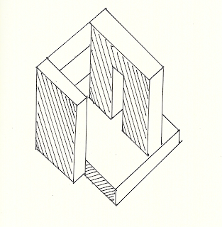
One pair of chosen axonometric


In SketchUp


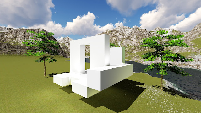
Four Images from Lumion Environment


Saturday, 29 April 2017

Week 05 - Independent Study

The Two Concepts


SANTIAGO CALATRAVA


For Axonometrics:
  1. Architecture should be aesthetically pleasing like a sculpture on a pedestal.
  2. Architecture is shaped by the manipulation of light and shadow.
  3. The spirit of a building shall not be diminished by the structural foundation.

For Light Rail Station:

  1. The use of oblique curves and symmetry to add dynamism.
  2. The visible skeleton: expressed structure: everything used is visible.
  3. Evoking the sense of movement through the building form.
  4. Inspired to seek simple forms in the hope of creating an emotional response.


FRIEDENSREICH HUNDERTWASSER


For Axonometrics:
  1. Generosity of space; Providing maximum space for individuals to interact with.
  2. Architecture as a playful, otherworldly place.
  3. Appreciates individualism, where building should not be think of as a whole but distinct spaces.


For Light Rail Station:
  1. The line between the building and landscape melds: the building as an extension of the landscape rather than as an addition to it.
  2. "The straight line is godless and immoral"


12 Axonometrics (6 pairs)


One Pair of Axonometrics created in class


In SketchUp


Two Images from Lumion Environment